
There's a tiny mark sitting on top of every lowercase i and j that almost nobody ever consciously notices.
For most of Latin history, that letter had no mark above it at all, just a plain vertical stroke.
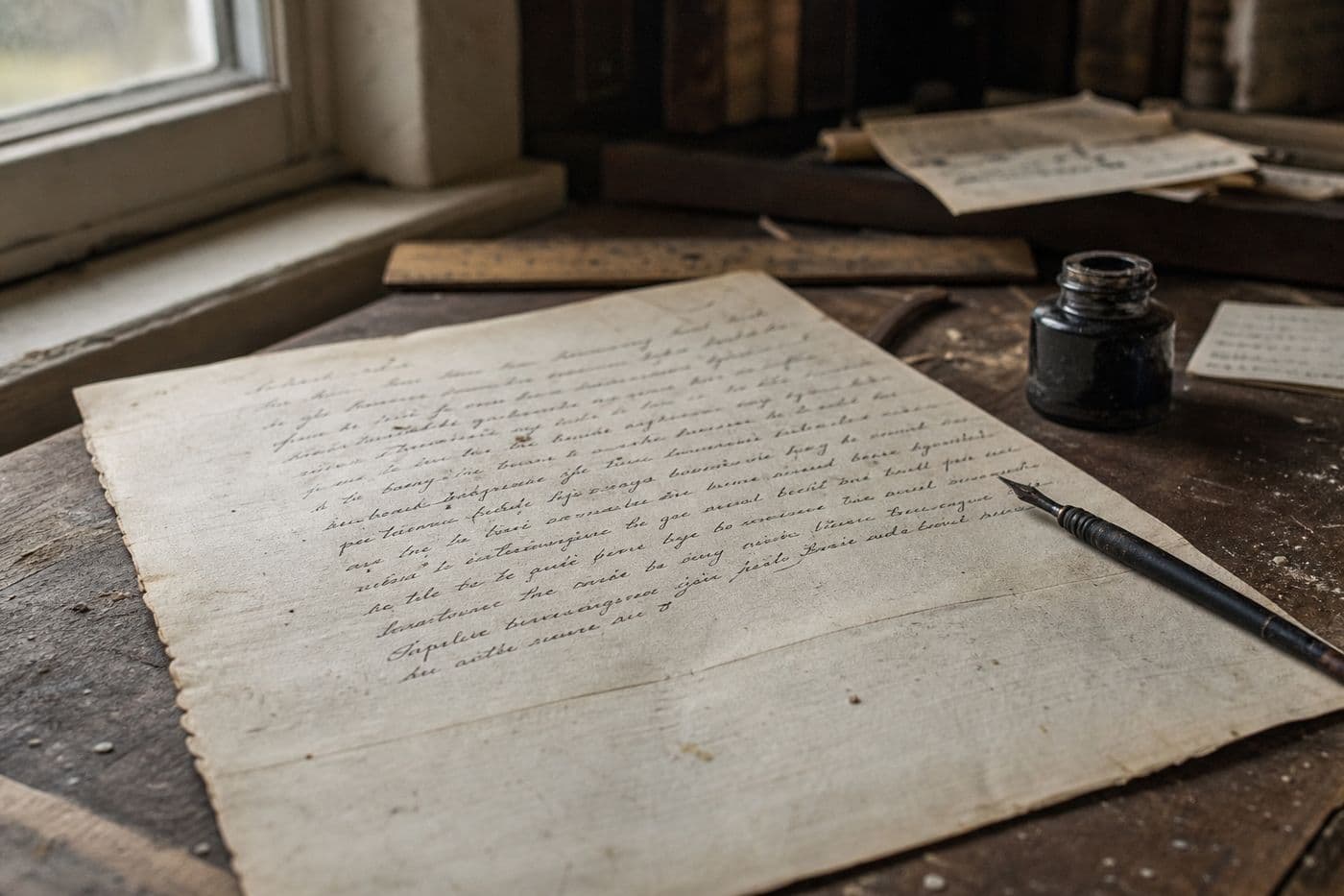
Medieval scribes writing in tight cursive script ran into a real problem: rows of i's, m's, u's, and n's blurred into unreadable clusters of lines.
Around the 11th century, scribes started adding a small stroke above the i to separate it from its neighbors, and readers instantly noticed the difference.
That tiny addition eventually became permanent, and today it has an official name in typography: the tittle.
The word survives in the old phrase 'jot and tittle,' pulled straight from a biblical reference to the smallest details of the law.
Type designers still use the term today when spacing letters, proving one scribe's fix for messy handwriting never actually went away.